Cheep
Track the prices of products across the internet and receive a text message when prices drop low enough to buy
Problem
Online shoppers want to be sure they're getting the best possible price. Existing shopping tools help with coupons or comparisons, but keeping track of things that shoppers are waiting to buy is an afterthought. Online shoppers need a better way to keep track of prices so they can take advantage of the best deals.
Overview
Cheep is a browser extension concept that enables people to add any item on the internet to a price-tracking list that notifies them when the prices meet the user's preferences. This was an assigned project by a product design mentor who helped me navigate the discovery, definition, design, and iteration of the product.
Objectives
Design a browser extension that improves the experience of shopping online by enabling users to track the prices of items they eventually want to buy and receive timely notifications when prices drop

Introduction
This project was assigned by a mentor of mine named AJ. I completed the work independently prior to our 1-hour meetings once per week. During those meetings, he reviewed my work, offered constructive criticism, and helped me identify next steps. It was exciting and humbling to learn what went into designing a product, and I’m grateful that he was willing to take the time out of his busy schedule to help me along on my journey.
Discovery & Definition
My first job was to research what we wanted to design. This included identifying and understanding user pain points and exploring existing solutions. During that first week, I spent a lot of time improving my understanding of the problem of cart abandonment and auditing similar products like CNET Shopping, Honey, and Capital One Shopping.

I documented what I learned and shared that with AJ during our next meeting. He helped me interpret the information and to begin writing a PRD. This is where I learned how to turn research into things like personas and problem statements. We continued by documenting our proposed solution, the assumptions we were making, and our criterion for success. We wrote user stories, identified and prioritized key features, and designed high-level UX flows.
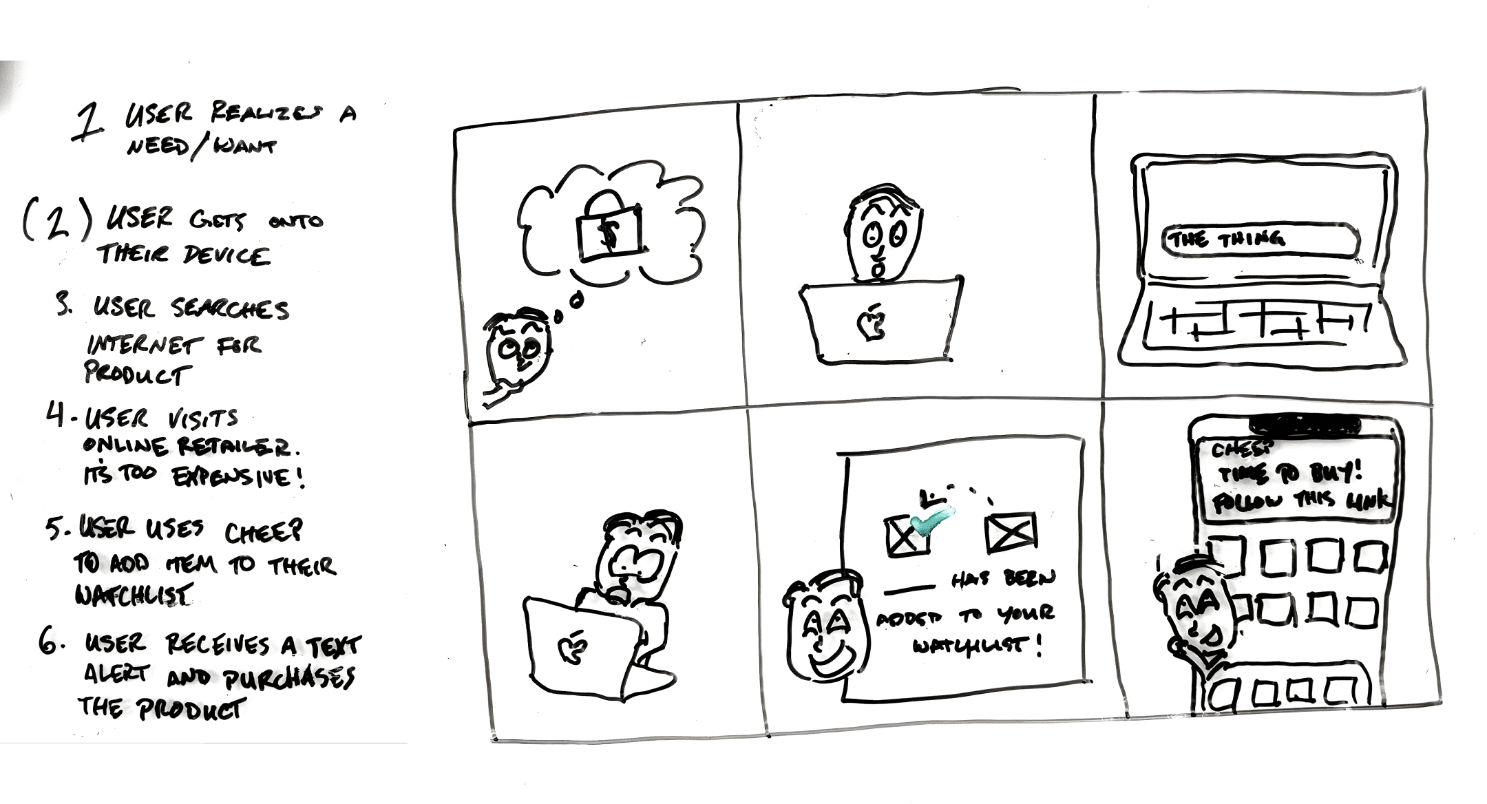
My next responsibility was to use that information to sketch out a few directions toward a solution.
Low-fidelity

I used a whiteboard to begin the process of exploration. As I did, I thought about what would actually be useful for people to see as they were shopping online. “Maybe the user might want to pin a certain item so that it’s always easy to find.” “Maybe people would find it valuable to see recent price drops all in the same place.”
I started to think about what UI elements specifically might be present. I sketched them freely out of context so that I would have a more clear toolkit to refer back to. This got me thinking about things like iconography, controls, and how to communicate status.

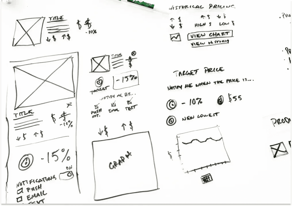
This is what I shared with AJ at our next meeting, and you can see that my Figma skills were pretty amateur here. However, this turned into a great opportunity for me to learn about design patterns. He asked me about each and every thing I decided to place on each screen. Sometimes I had an answer — sometimes I didn’t. Suffering through the discomfort of feeling stumped under pressure was good for me. I learned that I need to have solid reasoning to back up every choice I make.
After giving me a rudimentary education on design patterns, he helped me turn my designs into this. It was exciting to watch how quickly this came together after he explained what needed to improve. Applying principles like similarity, common region, and proximity made the interface more understandable at an intuitive level, and doing all of that using visual language that users have already learned makes it easier to recognize and use.
Next, I was assigned the responsibility of creating a style guide that we would use to create high-fidelity mockups.
High-fidelity
I’d never created a style guide before. I looked at a lot of reference material to try and figure out what was and what wasn’t supposed to be in one. It seemed clear that the style guide needed to define typography and the use of color at the very least, so I started there.
I shared my work with AJ, and it took no time at all for me to understand that I didn’t know nearly enough about typography and color as I needed to. The typeface choices weren’t always appropriate and the fonts I’d set lacked utility and balance. The color system I designed wasn’t any better. It was obvious that I didn’t understand the importance of contrast when selecting colors for an interface, and that’s something I heard about (somewhat passionately) during our meeting.
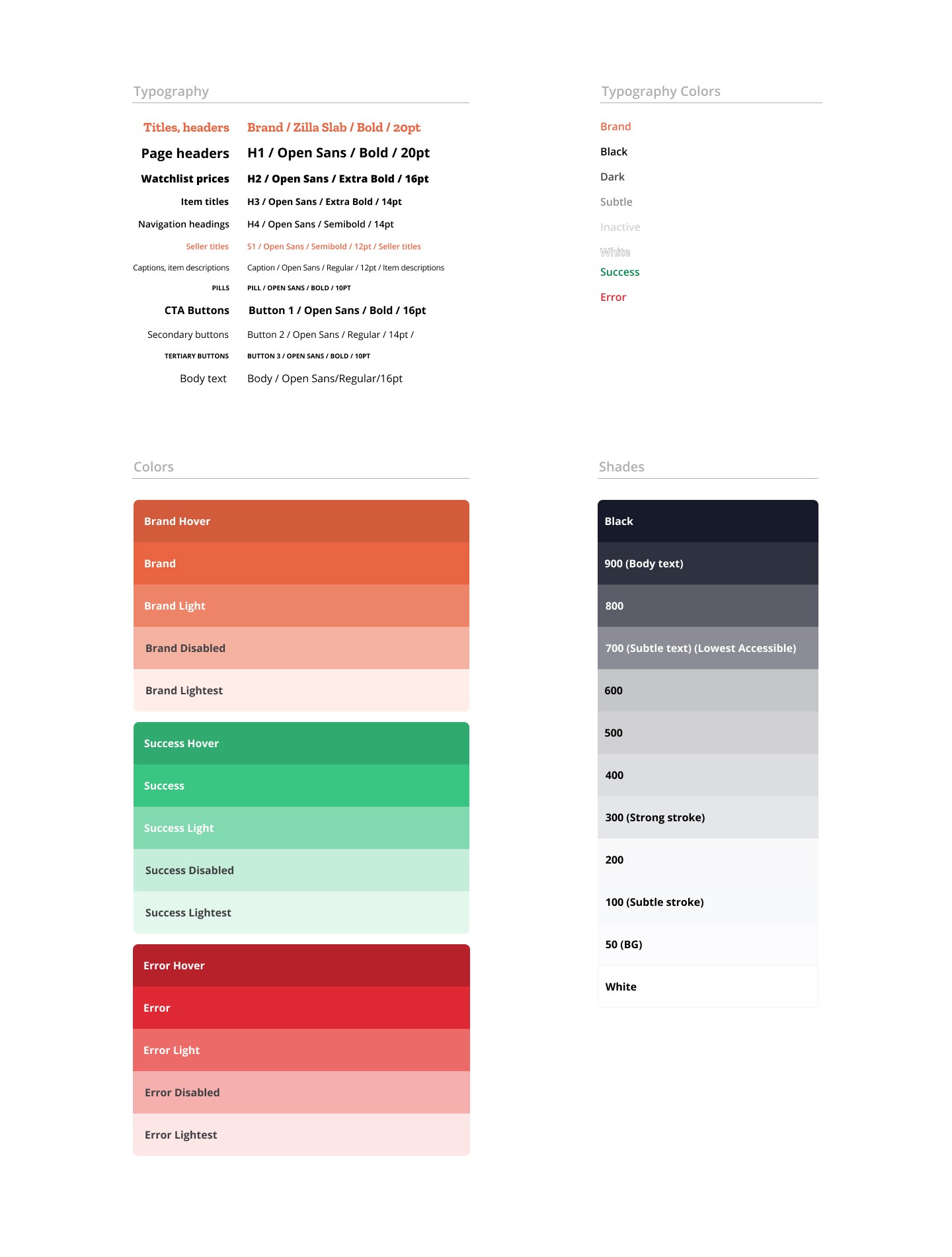
However, the criticism yielded the style guide you see here that, while not perfect, was much more useful for the work we needed to do. We had purposeful type styles and a color system that made designing an attractive interface more efficient.

Once we began applying the type and color styles set out in the guide, it didn’t take long to make our wireframes look like something people would actually enjoy using.
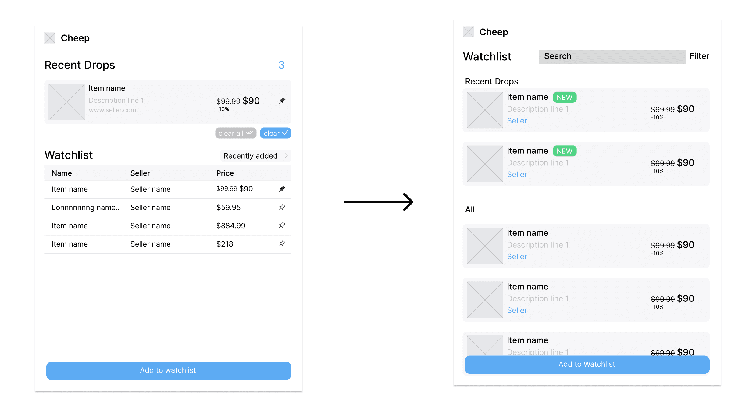
Now, although Cheep had new and improved look and feel, some things we designed weren’t translating well.
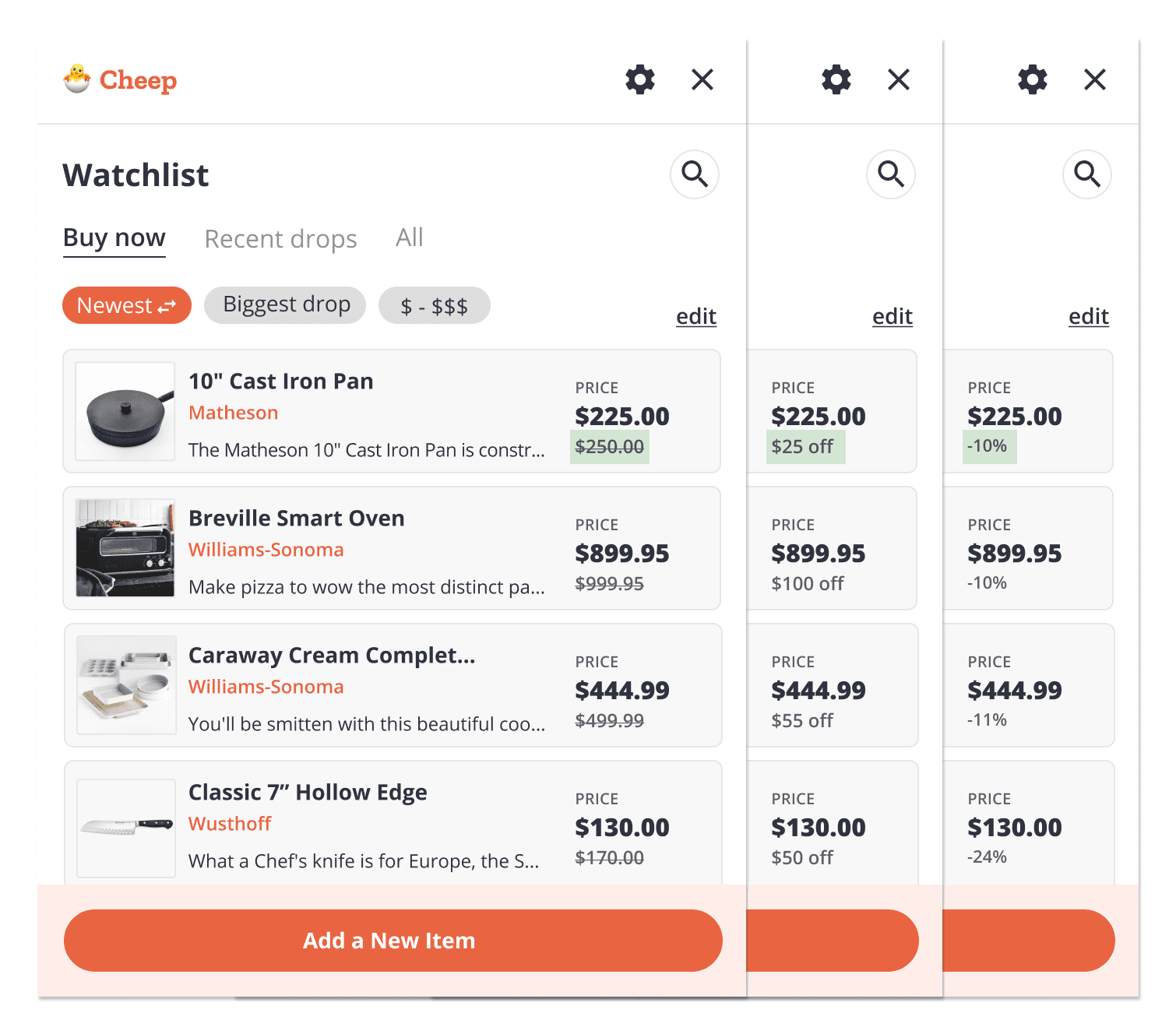
This design, for instance, didn’t end up working because of the limitation of horizontal space. We couldn’t find a good home for status updates like price changes. So we reimagined this section to read more like an itemized receipt.

The new design was easier to read and avoided any possibility of crowding horizontally.
Back to discovery
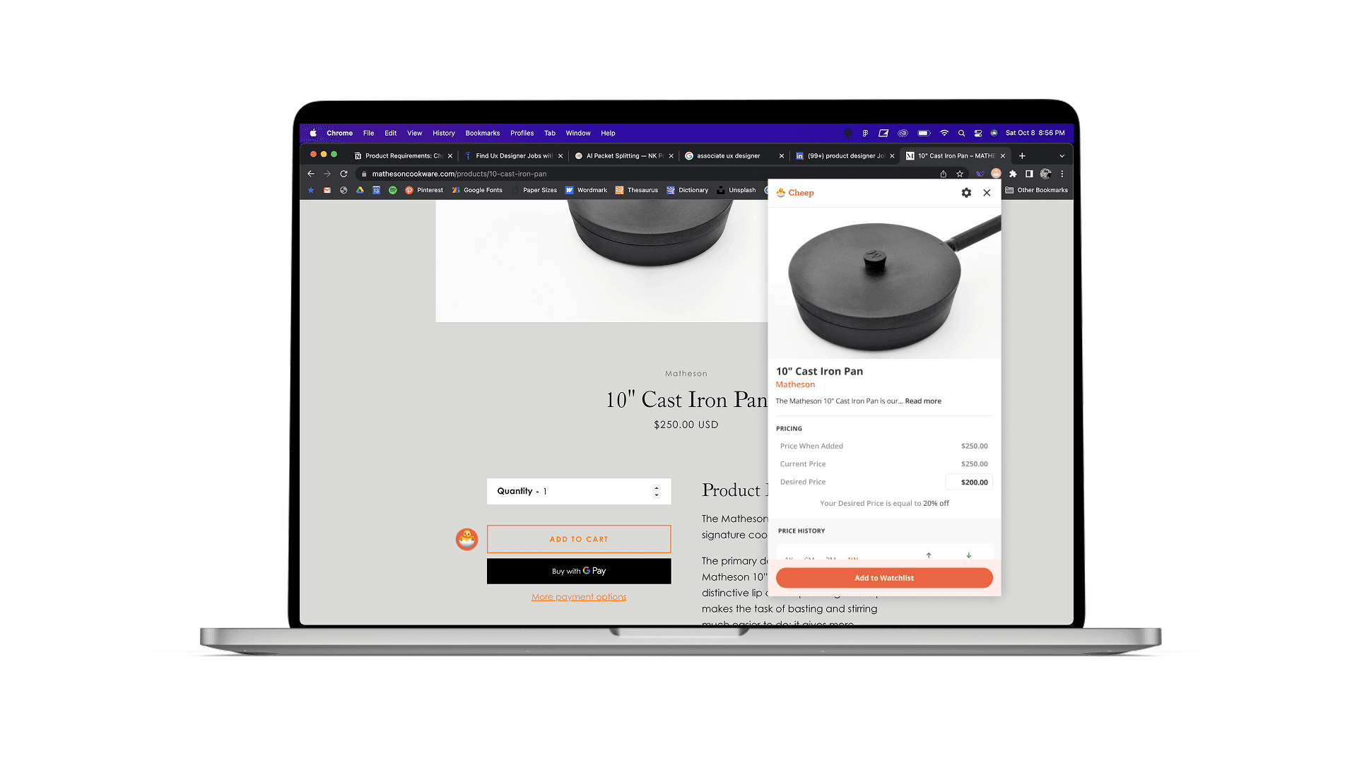
The product is all about keeping track of and communicating price changes. Therefore, how we displayed those prices and price changes was important to get right. How should we display price changes? Should we emphasize the discount as a percentage? As an amount? Which method will be most effective here? I had to return to discovery in order to find the answers.
Research into consumer psychology revealed that a reference price is the single most effective method for demonstrating the value of a markdown. Just a percentage is unclear: “20% off is great, but how much am I paying?” Just the discount itself is better, but still lacks clarity. Both together is excessive. A reference price on the other hand implicitly and efficiently answers the question “How good of a deal am I getting here?”

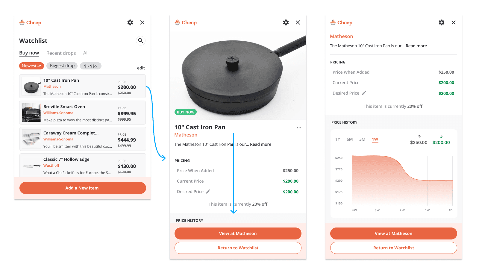
Final designs

Outcomes
Researched cart abandonment, price-tracking tools, and shopping-assistant patterns to define the product opportunity.
Translated discovery into personas, problem statements, assumptions, success criteria, user stories, and high-level UX flows.
Explored low-fidelity concepts, then refined them using established design patterns, clear hierarchy, and stronger logic.
Created a more useful visual system for typography and color, and applied it to high-fidelity screens.
Iterated on high-fidelity designs based on new findings
Reflection
It’s hard to measure just how much I learned over the course of this 8-week project, but the single most valuable thing I gained was a newly refined, holistic design process that more closely aligns with how products actually get built in the real world. Prior to working with AJ, my understanding of the design process was fragmented. Having a mentor there to help me connect those pieces into a coherent whole was a foundational experience for me as a designer.