Breadbox
Reducing food waste by turning what's in your kitchen into what's for dinner
Problem
Every week, home cooks buy groceries with good intentions — and then watch half of them expire. The herb bunch bought for one recipe. The leftover buttermilk. The can of coconut milk that's been in the pantry since last spring. Grocery lists live in one place, recipes live in another, and the kitchen pantry exists somewhere in between, unmapped and unaccounted for.
Overview
Breadbox is a mobile app concept built for home cooks who want to waste less and stress less. Users scan grocery receipts to populate a Pantry, then search for recipes filtered to what they have on hand. The less users have to think about what's in the fridge, the more likely they are to actually use it.
Objectives
To design a mobile experience that helps users make better use of ingredients they already have. The app aims to address the frustration of throwing away groceries and the hassle of finding recipe inspiration, while also contributing to the broader goal of reducing household food waste through smarter pantry management and meal discovery.
Research
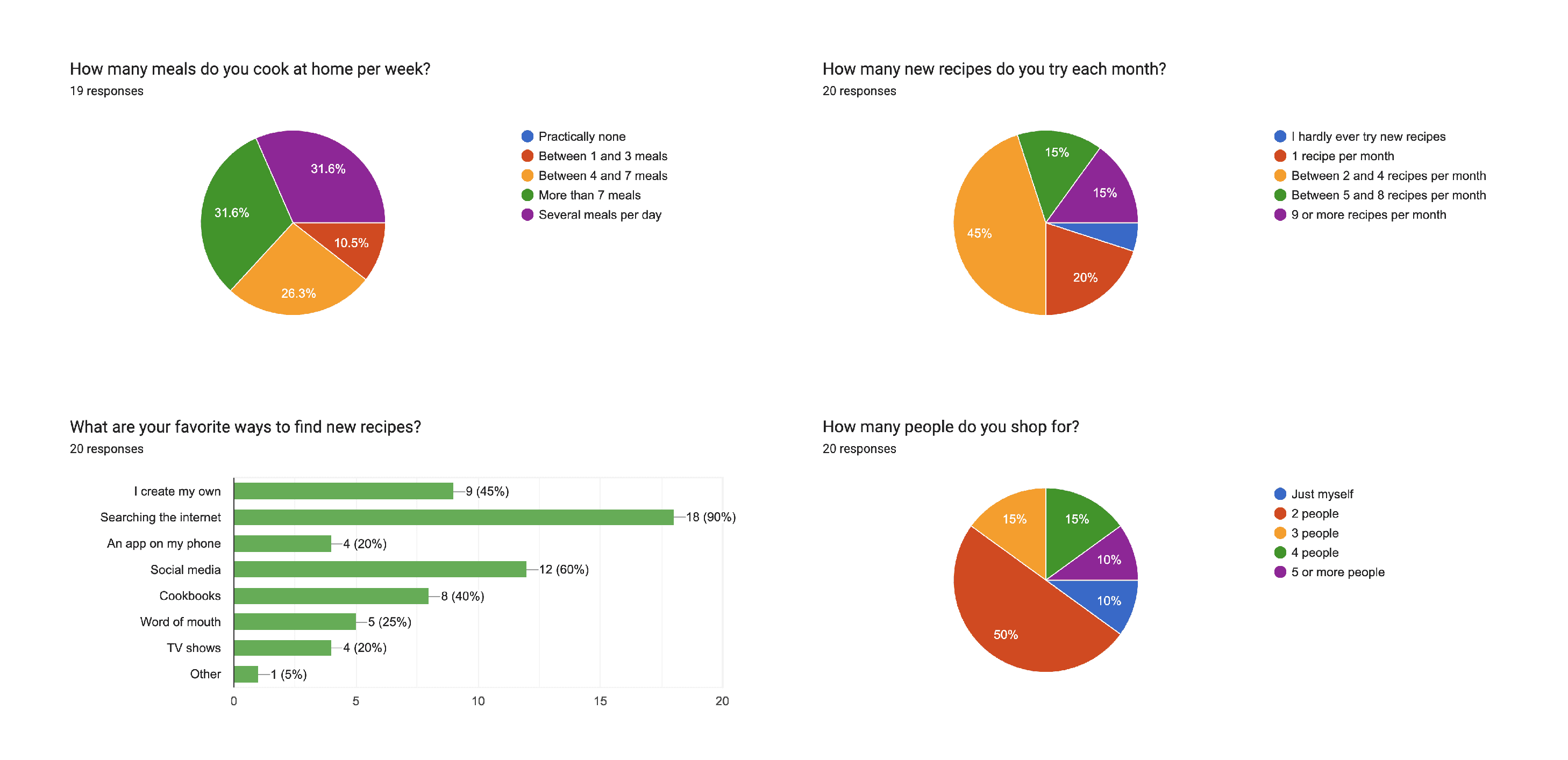
I designed and distributed a Google Forms survey targeting home cooks across a range of household sizes and cooking habits. 18 respondents completed the questionnaire, covering questions on cooking frequency, recipe discovery, grocery shopping behavior, list-keeping methods, and pain points.
Who responded:
Majority cook 4 or more meals per week, with several cooking multiple meals daily
Nearly all shop in-person, 4+ times per month
Household sizes ranged from 1 person to 5+, with $100–$1000+ monthly grocery spend
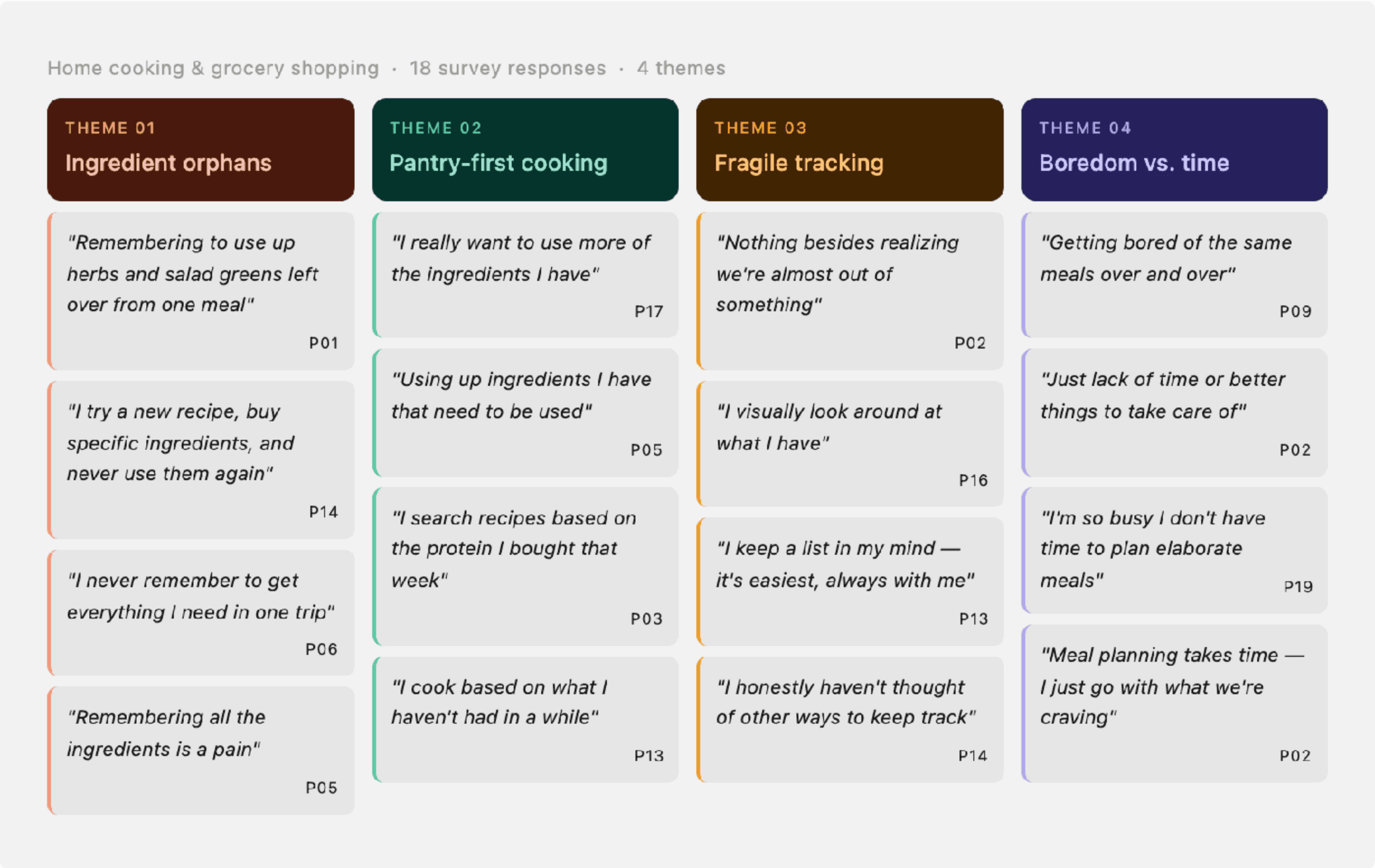
Themes & Insights
Reviewing responses for patterns produced four clear themes.
Theme 1: Ingredient orphans cause the most frustration. The most specific, recurring pain point was leftover ingredients from recipes — bought intentionally, used once, then forgotten. As one respondent put it:
"Remembering to use up the ingredients that I used for one meal and I have leftover of [is my biggest pain] — herbs, salad greens, etc."
"Not Knowing what recipes I can make with what I have [is my biggest pain]."
Another respondent was more blunt:
"If I try a new recipe, sometimes I buy really specific ingredients that I never use again."
Theme 2: People already want to cook from their pantry — it's just challenging. Several respondents described an improvised version of what Breadbox would simplify. People choosing meals based on what's already home and needs to be used up:
"I really want to use more of the ingredients I have."
"Combination of using up ingredients I have that need to be used and taking advantage of what is in season."
This validated the core concept early. Several respondents already cooked from what they had, working around the absence of any real system to support it. Breadbox just gives that habit somewhere to live.
Theme 3: Grocery tracking is fragile and personal. Respondents tracked groceries through paper lists, the Notes app, visual inspection of the fridge, and plain memory. When asked why, the answers were revealing:
"It's easiest."
"I'm lazy.
"It's always with me."
Theme 4: Boredom drives recipe exploration, but time and effort prevents follow-through. The most commonly cited trigger for trying new recipes was boredom with the rotation. But the most commonly cited reason it didn't happen more often was time:
"Having the time! I really enjoy cooking more elaborate meals but I am so busy I typically don't have the time to plan them out accordingly."
"Just lack of time or better/more pressing things to take care of."
Affinity map
Turning Insights into Features

With features defined, the next question was where everything should live. I used a see/do exercise to map each screen — what the user sees versus what they can do — before touching Figma. This keeps information architecture honest. I didn't want to waste time designing screens that I didn't have a clear reason for being.
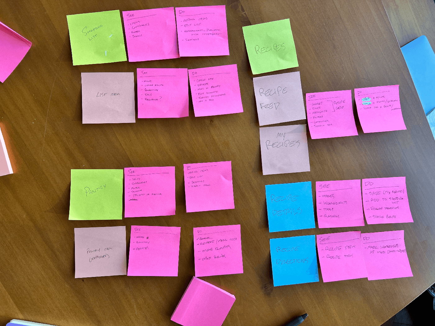
See/do activity using sticky notes
Design Phase
Low fidelity: I began with paper wireframes and low-fidelity digital screens to map the core task flows. Lo-fi allowed me to test structural decisions quickly like where the Pantry lived in the navigation, how receipt confirmation should work, and how recipes would surface pantry-matched ingredients.
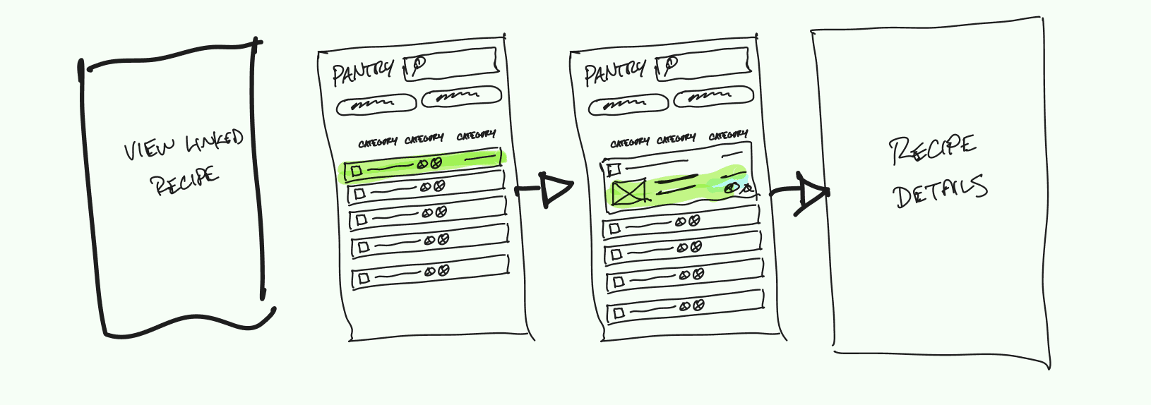
Exploring how a pantry item could link to a recipe
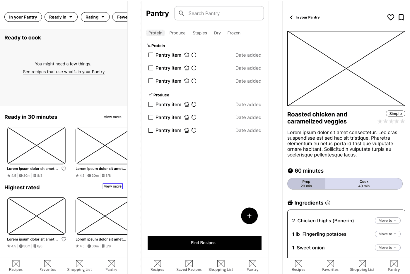
(Left) The early recipe screen borrowed its browsing pattern from delivery apps. This included horizontal categories, featured content, and a high volume of recipes. That works when discovery is the point, but here the goal isn't to expose people to new recipes; it's to use up what's in the kitchen. Using this pattern also made the interface to noisy to clearly identify what the user can cook right now without a trip to the store.
(Center) The early Pantry read as a checklist. Plain text rows, no images, a "Find Recipes" button at the bottom. This made it feel more like a to-do list, and nothing about it signaled that scanning a receipt was the intended way in. The intended interaction wasn't obvious.
The early designs included a shopping list, which seemed like the natural response to the fractured ways that people tend to handle grocery shopping, but a shopping list inside a pantry app asks users to change a habit that they've certainly already solved by now. Most people have a system, however imperfect. The simpler answer: make it easy to copy needed ingredients to the clipboard so they drop into whatever list app the user already uses. This yields the same outcome without the challenge of changing another behavior.
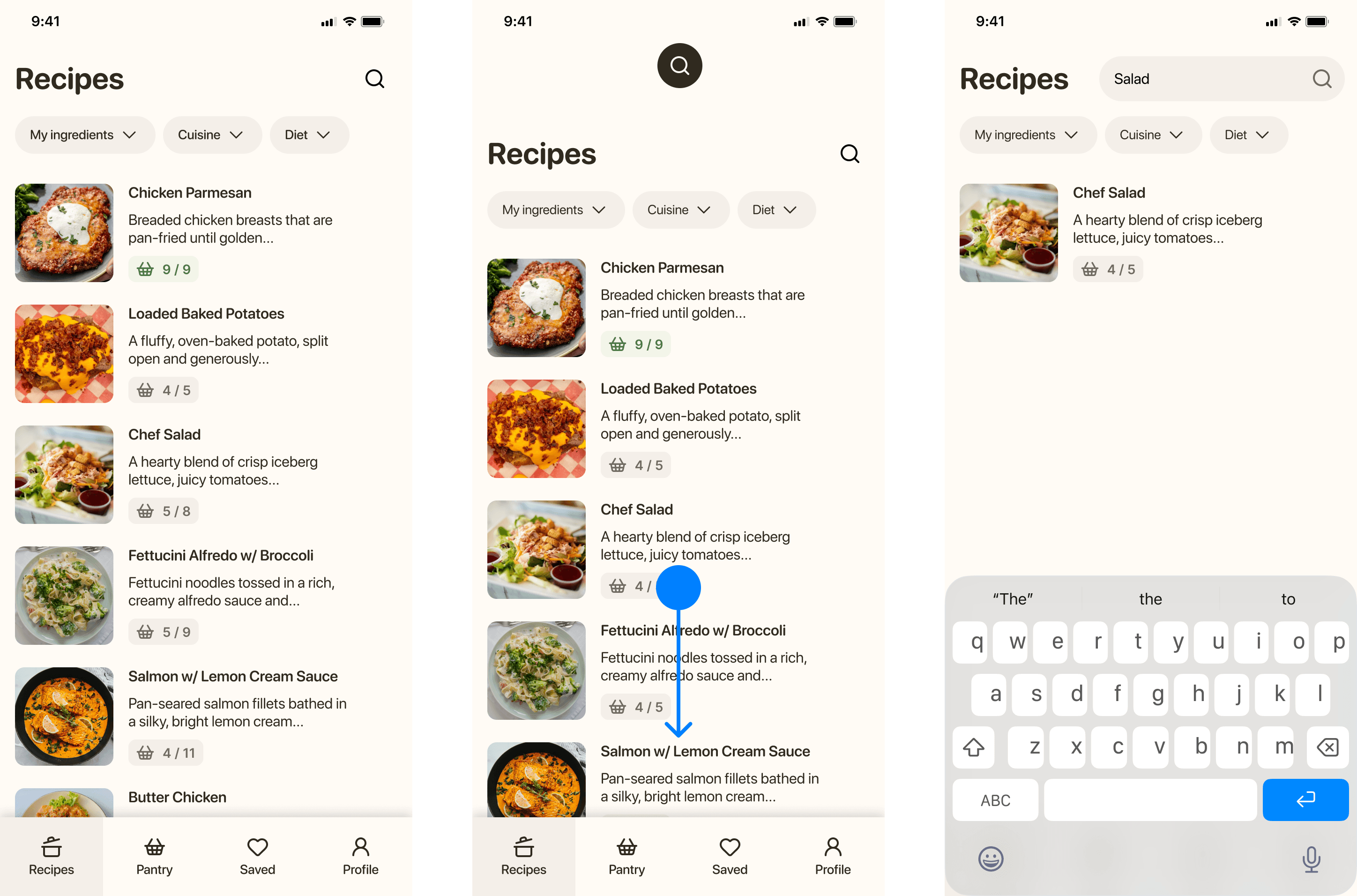
Earlier iterations used horizontal scrolling and featured categories, which pulled toward discovery. The final design is a vertical list, sorted by ingredient match. Recipes you can make tonight surface first. This is because Breadbox isn't meant to offer recipe inspiration, the goal is to be able to make something tasty without a ton of effort and use up the parsley in the crisper drawer in the process. Three filters (My Ingredients, Cuisine, Diet) let users narrow from there without adding friction. Pulling down opens search by name for users who already know what they want.
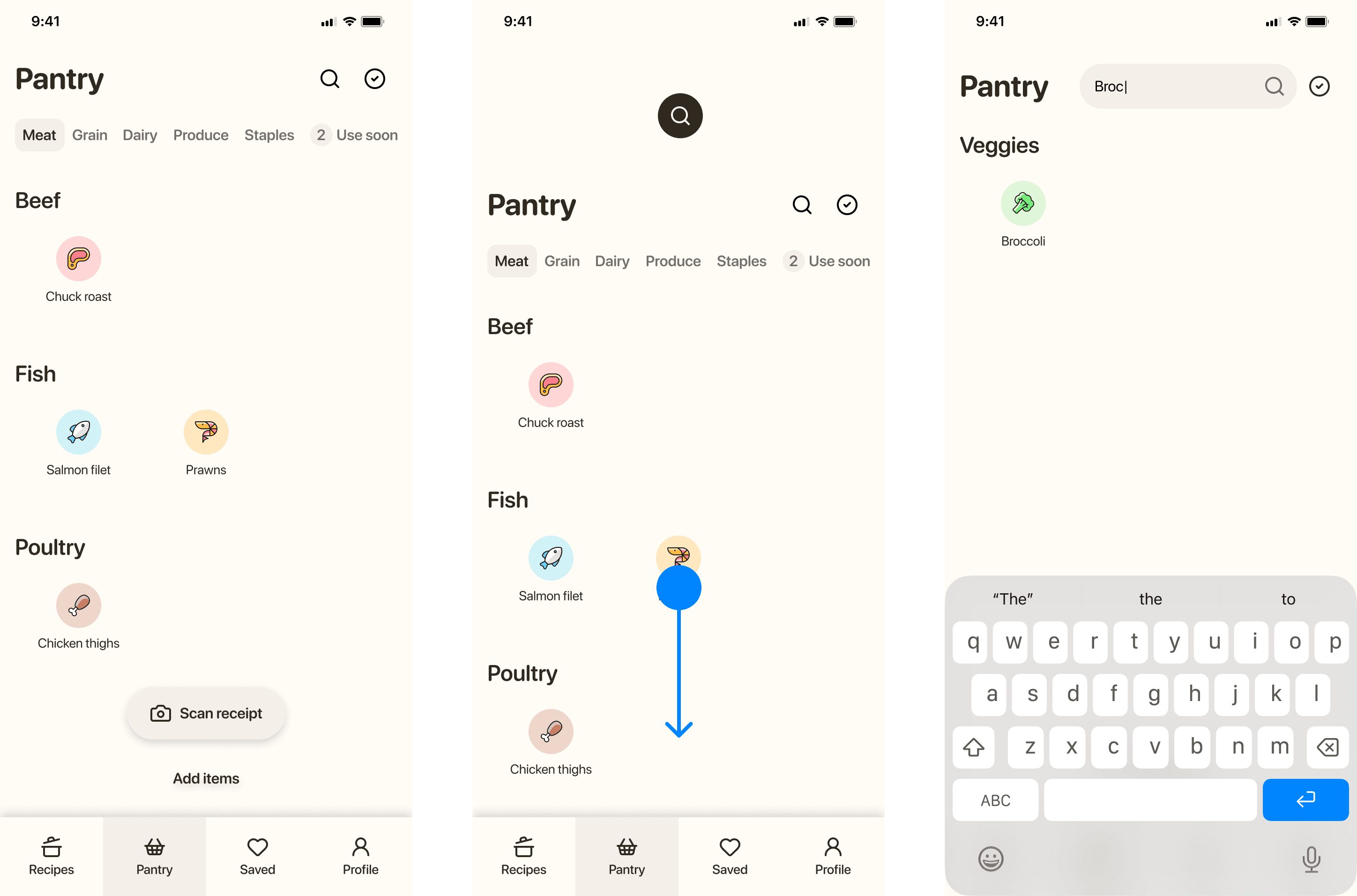
The Pantry is organized around food groups instead of an alphabetical list. Meat leads because that's how most respondents actually plan. Research showed that people plan around protein first, then everything else around it. Food images enhance the look and feel that gives the app some homey charm and makes the app feel closer to actually opening a pantry door. Within each tab, subcategory headers keep browsing scannable without requiring search.Users can swipe down to find a specific ingredient by name, recycling the same gesture as Recipes, which is one less pattern to learn.
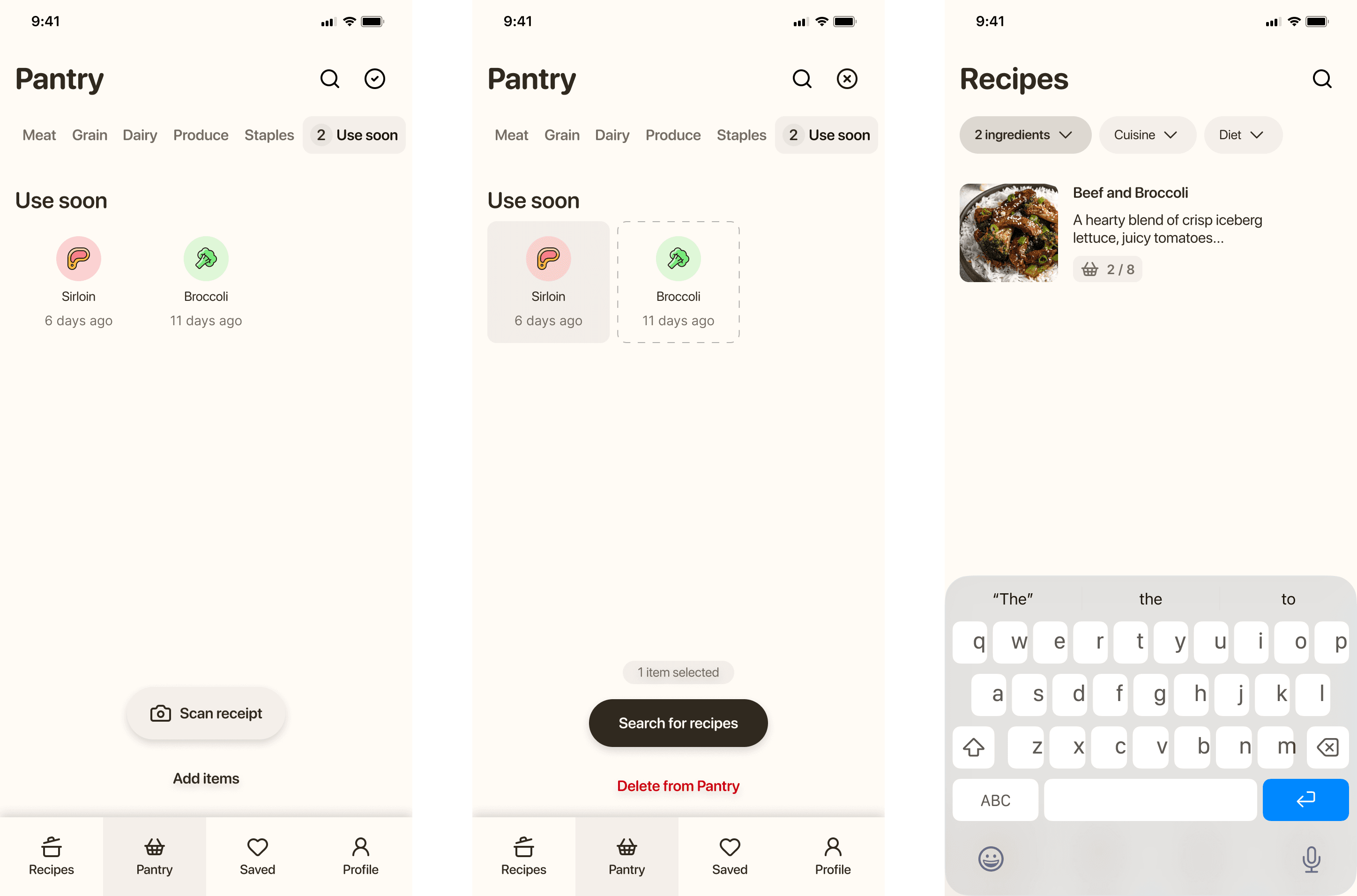
The "Use soon" tab surfaces items that have been in the Pantry longest. The date each item was added only appears here, not on the main Pantry view. Seeing that eggs were added eight days ago is only useful information when you're thinking about what to cook before things turn; the rest of the time it's just noise. For the same reason, I thoughtfully chose to avoid notifications and alerts wherever possible. Push notifications and banners that tell users to use chicken thighs communicates more urgency than is warranted — or helpful. A designated place in the app that the user can quickly navigate to when they're interested to know what needs to be used up is a calmer alternative. Selecting items from "Use soon" and tapping "Search for recipes" applies them as filters on a new search. Looks like we're having beef and broccoli.
Outcomes
Validated the concept through user research and competitive analysis, confirming that food waste and recipe inspiration are common household pain points.
Produced cohesive user flows and high-fidelity mockups that visualize how receipt scanning and pantry tracking could seamlessly integrate into daily cooking routines.
Applied insights to simplify task flows and reduce cognitive load during recipe discovery.
Translated user survey findings and thematic insights into meaningful design decisions and prioritized features.
Demonstrated a clear process from research to concept design, highlighting how UX methods can address food waste and meal-planning frustrations.
Reflection
Several respondents already cooked from what they had, improvising a version of Breadbox manually and inconsistently. That meant the concept didn't need to create a new habit, only support an existing one.
If I were to extend this project, the next step would be moderated usability testing on the receipt scanning flow specifically. That interaction carries the most weight and the most potential for friction, and lo-fi testing alone can't stress-test it adequately.